Dark blue/black/white away colours > yellow away colours.
The yellow away shirt we had in the 13/14 season was a thing of beauty 
1 Like
I thought we were getting Adidas next season.
Disappointed 
I actually really like that home kit. Love that effect in the red.
1 Like
New kit maker would start in 19/20
The home and away kit are pretty nice, I like them, but that teal monstrosity is horrific.
We need more yellow away kits.
1 Like
If that is true I think that would be the best year for us with Puma. Like all three.
Why do we have a goalkeepers top as third kit. I know we are lacking a keeper but do they expect everyone to have a turn or something.
3 Likes
13/14 away shirt was so boring and plain  .
.
Really like the away kit of next season is that is true.
All 3 tops are fckn grim !!
Boring?
It was sex! You’re a man of bad taste ![]()
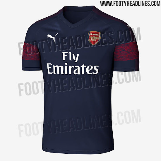
So much nicer than this season’s dip dab blue away
If I’m in London for the summer I might check the stores out for this one. It seems like the official website is more expensive.
How any one can’t like this is beyond me. It’s fucking class. Best home top puma have done for us
2 Likes
https://twitter.com/dawesy2801/status/990868654165319680
Well this is a bit d different to the one above and looks shit lol
Wtf puma
From the side it looks like he’s wearing a captain’s armband
1 Like
Meh bit shit if you ask me
2 Likes
It’s actually amazing how much worse it looks just by introducing a little bit more white in around the collar.
7 Likes
The worst looking home kit we’ve ever had.
5 Likes
Lol! Fucking shit! Don’t like it! It looks a pijama.